How to make a good profile picture for YouTube from one photo
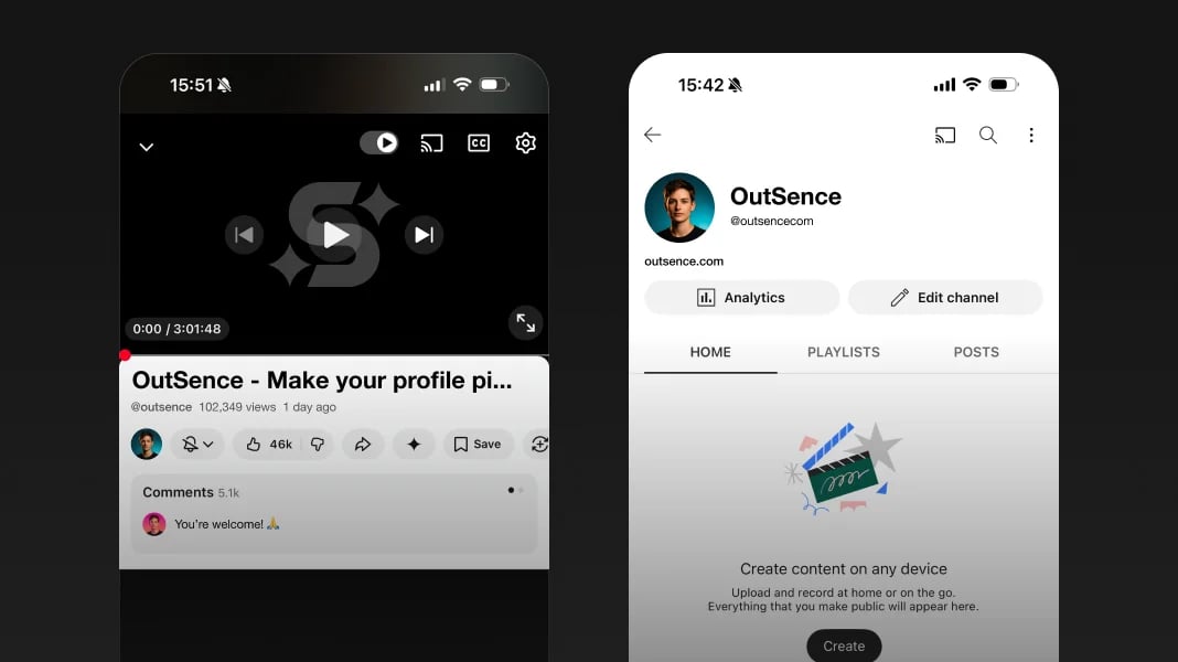
A YouTube profile picture does not mainly live as a personal portrait. It lives as part of a channel brand. Viewers see it next to comments, on the channel page, and around video surfaces, so the image has to do a harder job than “look good.” It has to act like a repeatable visual signature. Source
That is why one good photo can still be enough for YouTube, but only if you shape it into a channel icon rather than leaving it as an ordinary headshot. Once you know what your channel needs to signal, OutSence can help you compare a few channel-ready directions from that same photo.
Your channel icon is part of the brand system
YouTube explicitly treats the profile picture as the signature image or logo that represents the channel, not as a decorative extra. That framing matters. It means your picture is part of how people recognize the channel before they remember exact titles, thumbnails, or upload schedules. Source
Weak YouTube profile pictures often fail because they are good photos but weak icons. The face is too small, the styling is too subtle, or the image depends on details that disappear once YouTube reduces it. A good channel picture should still feel identifiable even when the viewer does not stop to study it.
Turn one photo into a YouTube icon people remember
If you have one usable photo, treat it like raw branding material:
- Choose the photo that already feels most like the channel owner. Presence and recognizability matter more than atmosphere.
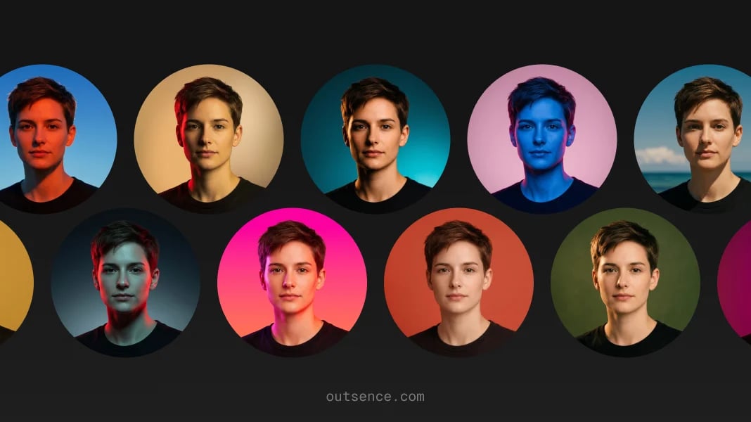
- Set a crop around identity instead of scenery. In OutSence Create, frame the image so the face or central mark reads quickly.
- Pick styles that simplify memory, not styles that complicate it. Clean, steady, and recognizable usually beat moody or over-detailed on YouTube.
- Compare the versions as channel icons. Ask which one looks most like the symbol viewers would remember after seeing your videos twice.
- Keep the version that supports repetition. YouTube rewards images that feel consistent across uploads, comments, and the channel page.
Decide whether the channel should lead with a face or a mark
If the channel is built around you as a person, a face is usually the best answer. That includes teaching channels, commentary channels, lifestyle creators, and any format where viewers are meant to recognize the creator behind the content.
If the channel is topic-led, studio-led, or brand-led, a face is not automatically best. A logo, monogram, or simple symbol may do a better job. The honest answer on YouTube is not always “use a portrait.” It is “use the identity marker viewers can recognize fastest.”
This is also where YouTube differs from Instagram. Instagram can let a profile picture carry mood. YouTube usually asks it to carry memory and consistency.
Quick channel icon check before you publish
Before you commit to the final version, check whether the image behaves like a real channel icon:
- Channel page: does it feel like the right signature for the whole channel?
- Comments: does it still read clearly next to your name and text?
- Repeat recognition: would a viewer recognize it after seeing your videos a few times?
- Brand fit: does it match the tone of your thumbnails, titles, and content style?
- Small-size clarity: does the face or symbol stay strong when the image is reduced?
The picture and banner should work like one promise
YouTube’s own branding guidance makes this explicit: strong channel brands are easier to remember when the profile picture and banner image share a consistent look, feel, and voice. That means your picture should not be chosen alone. It should make sense beside the banner, the upload style, and the overall promise of the channel. Source
A face-led educational channel may want a clean, direct icon beside a tidy banner. A gaming or entertainment channel may want more color or graphic energy. The point is not to make the two visuals identical. It is to make them feel like they belong to the same creator.
YouTube branding is channel specific so your icon can be channel specific too
Verified on April 17, 2026
YouTube says your profile picture is shown to viewers on your channel, videos, and publicly attributable actions across YouTube, and that it renders at 98 × 98 px. It also says that if you change your YouTube channel name and picture, the change is visible on YouTube only, while your Google Account name and picture can be changed separately. That is a strong practical reason to treat your YouTube icon as channel-specific branding rather than a one-size-fits-all identity photo. In practical terms, a clean 1024 × 1024 source image generated in OutSence gives you room to crop for YouTube’s small-icon environment without forcing the same exact identity choice onto Gmail or the wider Google account. Source Source
Related guides
If you want a version of the same photo built more around mood than channel memory, read How to make a good profile picture for Instagram from one photo. If you need a more forceful creator-first version, read How to make a good profile picture for TikTok from one photo. If you want to compare multiple icon directions before publishing, start in OutSence Create and review them in your OutSence gallery.
FAQ
What kind of photo works best for a YouTube profile picture?
Usually the one that already feels most like the creator behind the channel. On YouTube, recognizability and repeat memory matter more than portrait atmosphere.
Should I use a face or a logo on YouTube?
Use a face when the channel is clearly person-led. Use a logo or simple mark when the channel is concept-led or brand-led.
How closely should the profile picture match the banner?
They should not be identical, but they should feel like the same brand. A mismatch between the icon and banner weakens channel memory.
When is OutSence useful for YouTube?
When you already have one good photo and want to compare a few cleaner, more channel-ready icon directions before choosing the one viewers will remember best.